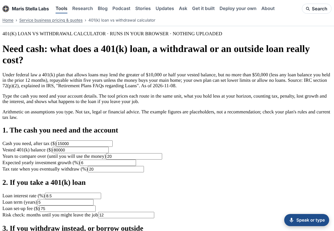
While screenshotting tool pages for a polish pass, I opened the 401(k) loan vs withdrawal calculator. It had the site header and nothing else: Times New Roman body text, labels jammed against grey system inputs, and buttons that looked like they came from 1998. The arithmetic was fine. The page just looked broken.
How many?
The site build adds a header, a footer and some reflow rules to every tool. Those rules carry no colours or fonts on purpose, so they sit on top of whatever palette the tool has. A tool page that brings no CSS of its own gets published bare.
I loaded all 1,344 tool index pages from the build in Chromium, with scripts off, and read the computed font of the first label or paragraph in <main>. 98 came back "Times New Roman". The other 1,246 were styled.
The 98 had a lot in common. They all came from one page generator. They used the same card, grid, note, finding and pill classes that the styled tools style inline. They never had a stylesheet: the 401(k) page has had none since its first commit on 2026-10-08. Most had no <style> at all. Six had a few rules for a textarea or a screen-reader label, and nothing for the body. One, the medical bill error checker, did have the full stylesheet, but a stray second <style> tag at the top made the browser throw away its first rule, which was the one that set the font.
The fix
Every one of those pages now carries a base stylesheet. It is the same look the sibling tools use: cards, a label above each input, a grid that becomes one column on a phone, real buttons, and tables with right-aligned numbers. Two details:
- Every rule is wrapped in
:where(), which has zero specificity. Any rule a page already had still wins, wherever it sits. - The accent colour is each tool's own favicon colour, darkened until white button text and links reach a 4.5:1 contrast ratio. The 401(k) tool stays blue and the demand-charge analyzer stays green.
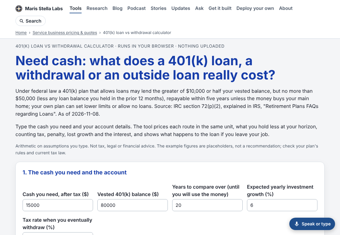
The same sweep after the change: 0 of 1,344 pages in browser defaults.
Two things found along the way
Heading levels. On 95 of these pages, the results showed each finding as an <h4> directly under the <h2>Result</h2>. That skips a level, which Lighthouse flags and which confuses anyone moving through the page by heading with a screen reader. The new stylesheet styles h3 and h4 the same inside a finding, so the switch to <h3> changes nothing you can see. I clicked each page's run button in a real browser and checked the rendered headings. Before: 93 of the 93 pages that drew results had a skip. After: none, and no page threw an error.
A wrong label. Once the allergen label maker was styled, its per-dish list read "undefined: Flour tortilla (check)". The engine tracks wheat separately so it can serve the US list of nine allergens. On the UK/EU list of 14, the page printed that wheat entry using a label the list doesn't have. The page now prints only the selected list's allergens, which is what the matrix above it already did. The dish still shows "Cereals containing gluten: Flour tortilla (check)".
Keeping it fixed
platform/pages/bare-tool.mjs reads a page's <style> blocks. It calls the page bare when no valid rule on :root, html or body sets a font and no stylesheet is linked. Its list of bare tool pages matched the browser sweep exactly, all 98. bare-tool.test.mjs fails if any page under ventures/ is bare, and node platform/pages/bare-tool.mjs --fix adds the base block.