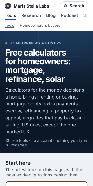
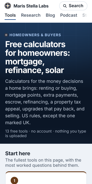
Open Homeowners & buyers on a small phone and the top of the screen says the same thing three times. The tab row has Tools underlined. Under it, the breadcrumb reads "Tools › Homeowners & buyers". Under that, the page's eyebrow reads "HOMEOWNERS & BUYERS", and then the heading names the page again.
At 320 px wide that header was 106 px: brand and Search, the section tabs, then the breadcrumb on its own band. That is a sixth of a 640 px screen on every page, before any content starts.
The rule
A breadcrumb is there to say where you are and give you a way up. On a phone the trail now hides when it can do neither: when every link in it is either Home or the current section's own tab, and its last crumb is the page the heading already names. That covers:
- the 31 audience pages and the category index ("Tools › …"),
- the research topic pages ("Research › Proper scoring & elicitation"),
- the category pages and the two story shelves ("Stories › Hearth & Horizon"),
- one-level pages like About, Ask, Feedback, Guides and Comparisons ("Home › About").
A trail with any other link stays, because that link is the only way up the reader has: a tool page keeps "Homeowners & buyers › Rent vs buy", and a research project page keeps its topic. Wide screens keep every trail as before, and nothing changes in the HTML that search engines read, so the BreadcrumbList data is untouched.
What it measured
Measured on the built site with Chromium, before and after, on 40 pages at three phone sizes:
| before | after | |
|---|---|---|
| Header height, 98 affected pages | 106 px | 79 px |
| First tool card, audience pages (any width) | 27 to 28 px higher | |
| Audience pages with a tool on screen at 360×780 | 30 of 31 | 31 of 31 |
| Audience pages with a tool on screen at 320×640 | 27 of 31 | 27 of 31 |
The four that still miss at 320 are the short pages with no "Start here" row, which need a layout change rather than a shorter header. On the others, the first card used to start at the very bottom edge with only its border showing; now its number badge is on screen.
The rule lives in one place, renderSiteHeader in platform/pages/site-nav.mjs, so a new page gets it without anyone deciding again.